Western Connecticut State University

WESTERN CONNECTICUT STATE UNIVERSITY
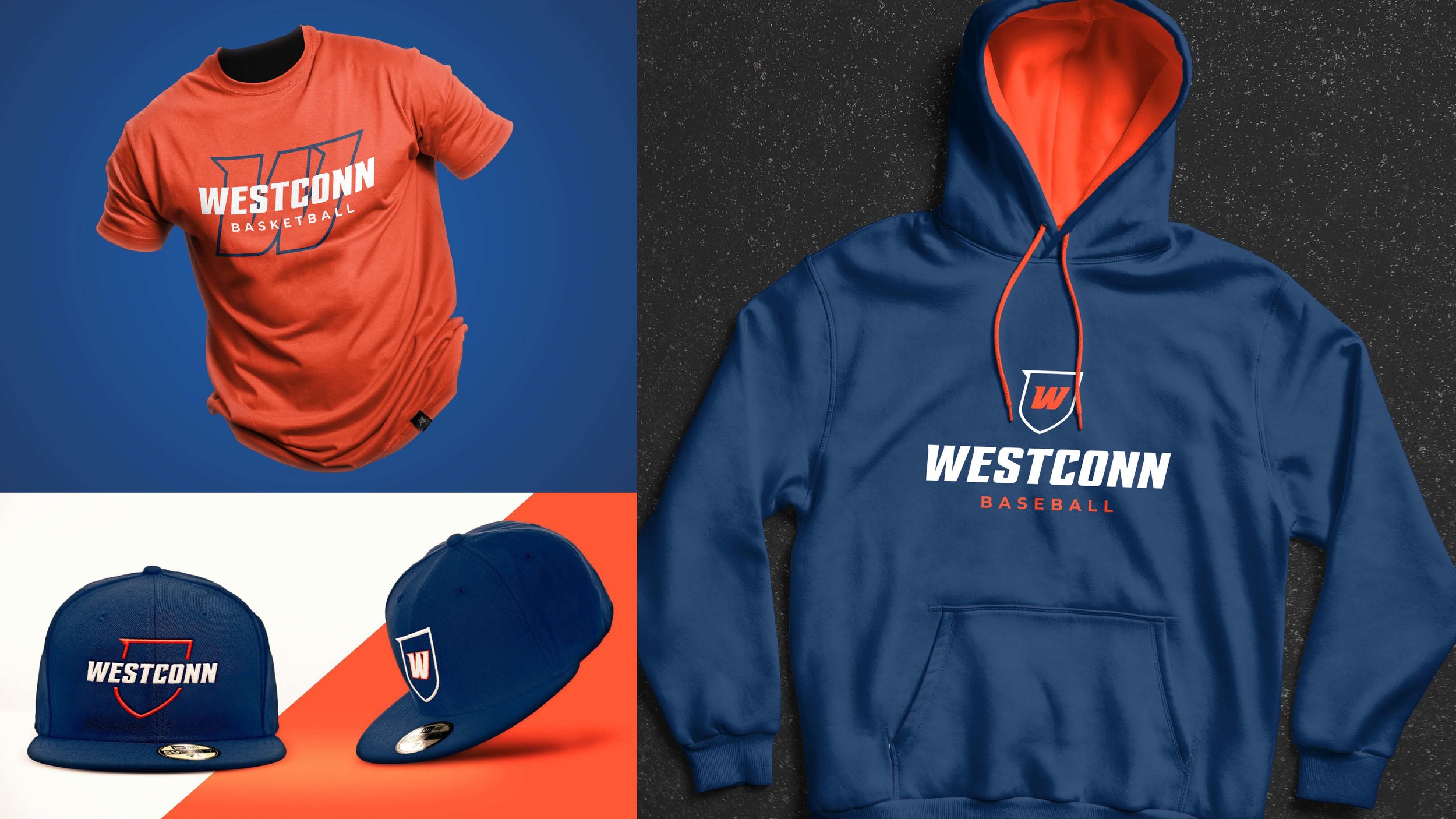
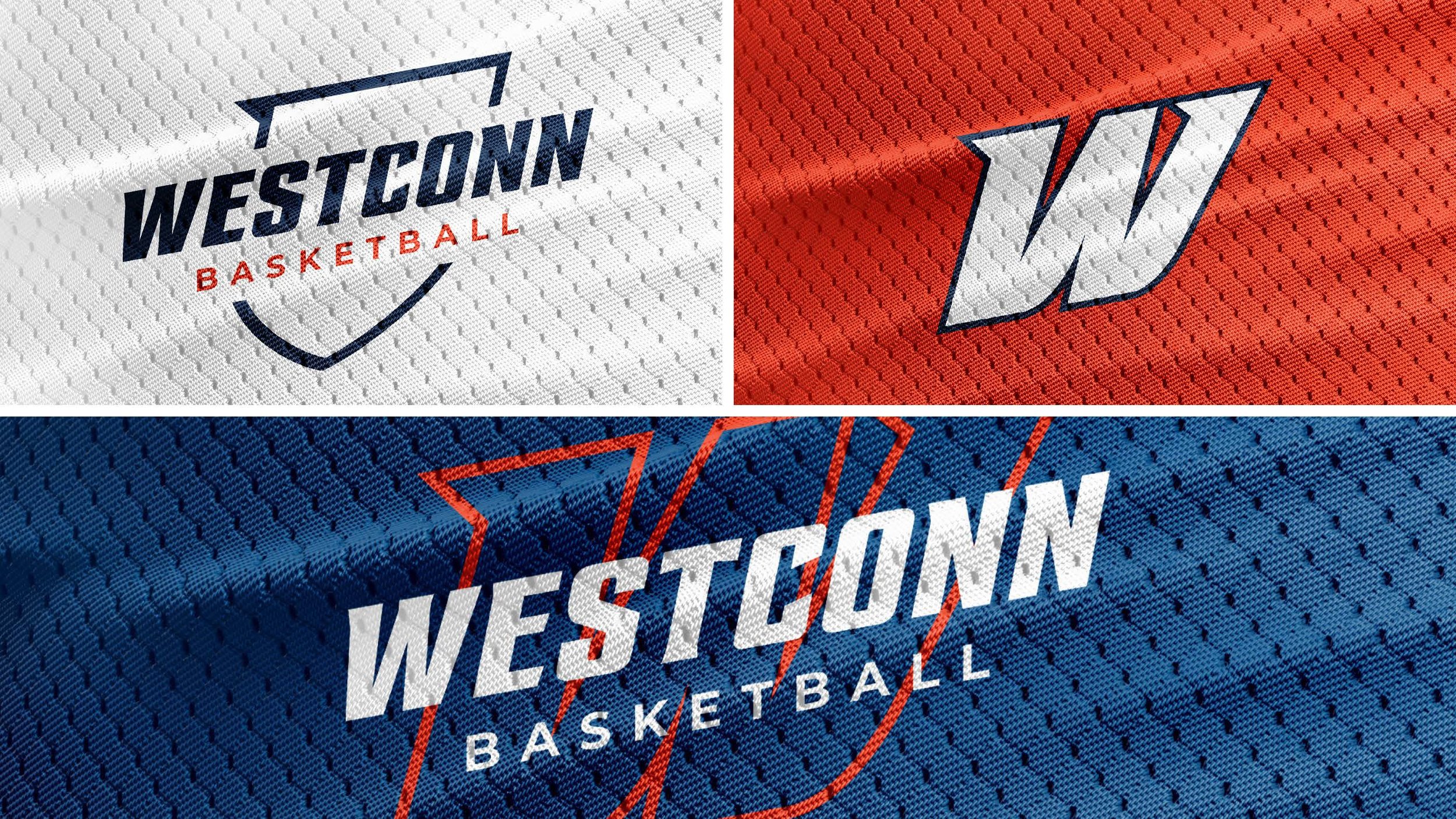
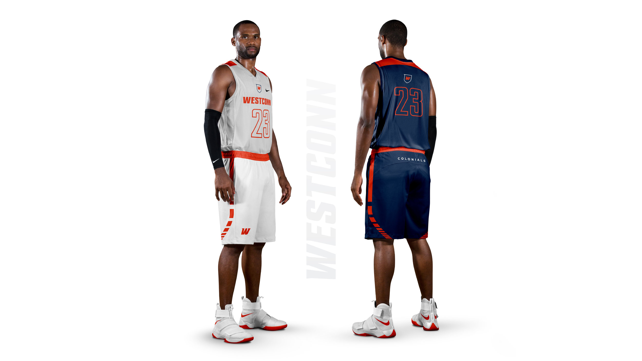
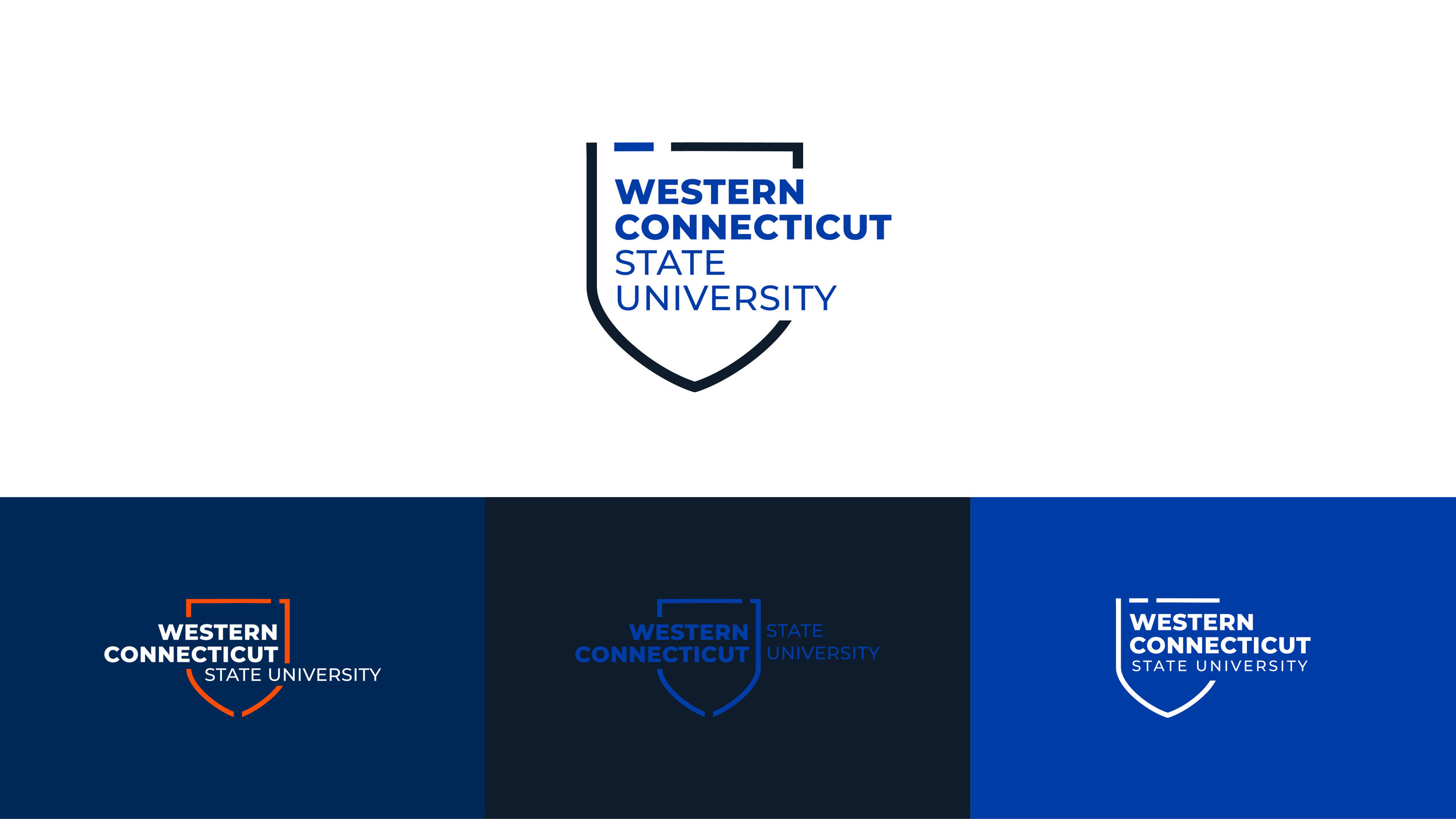
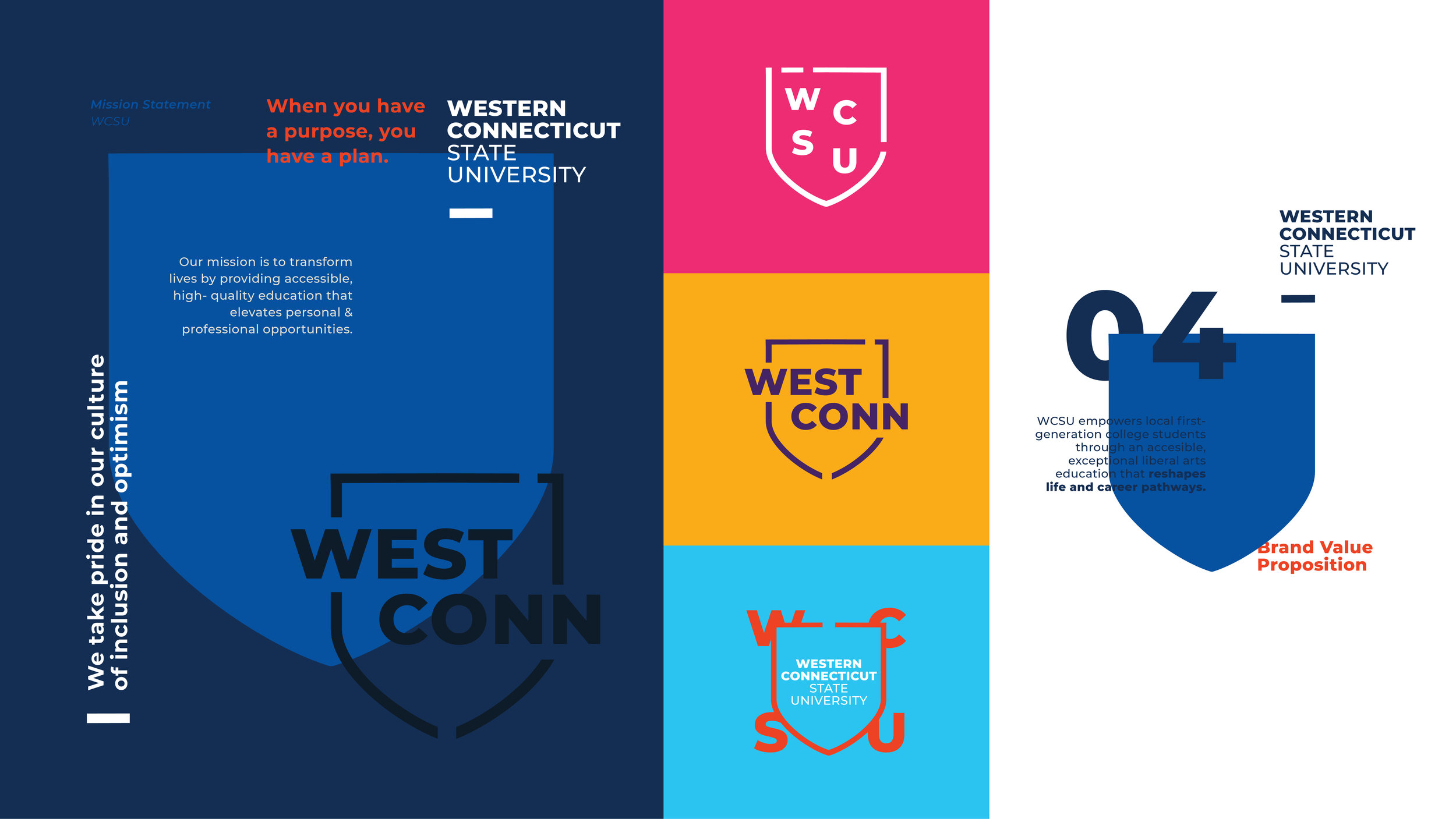
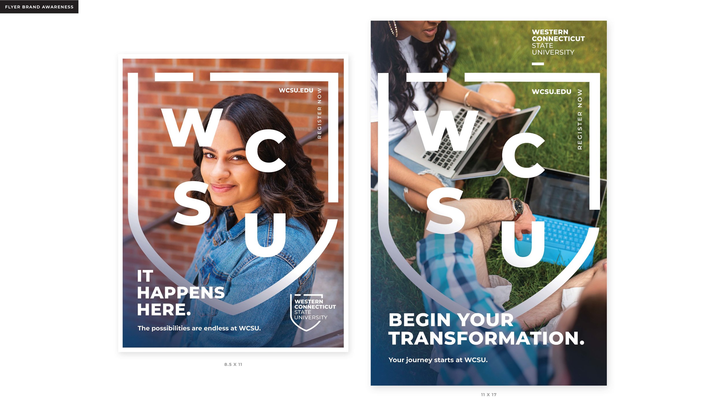
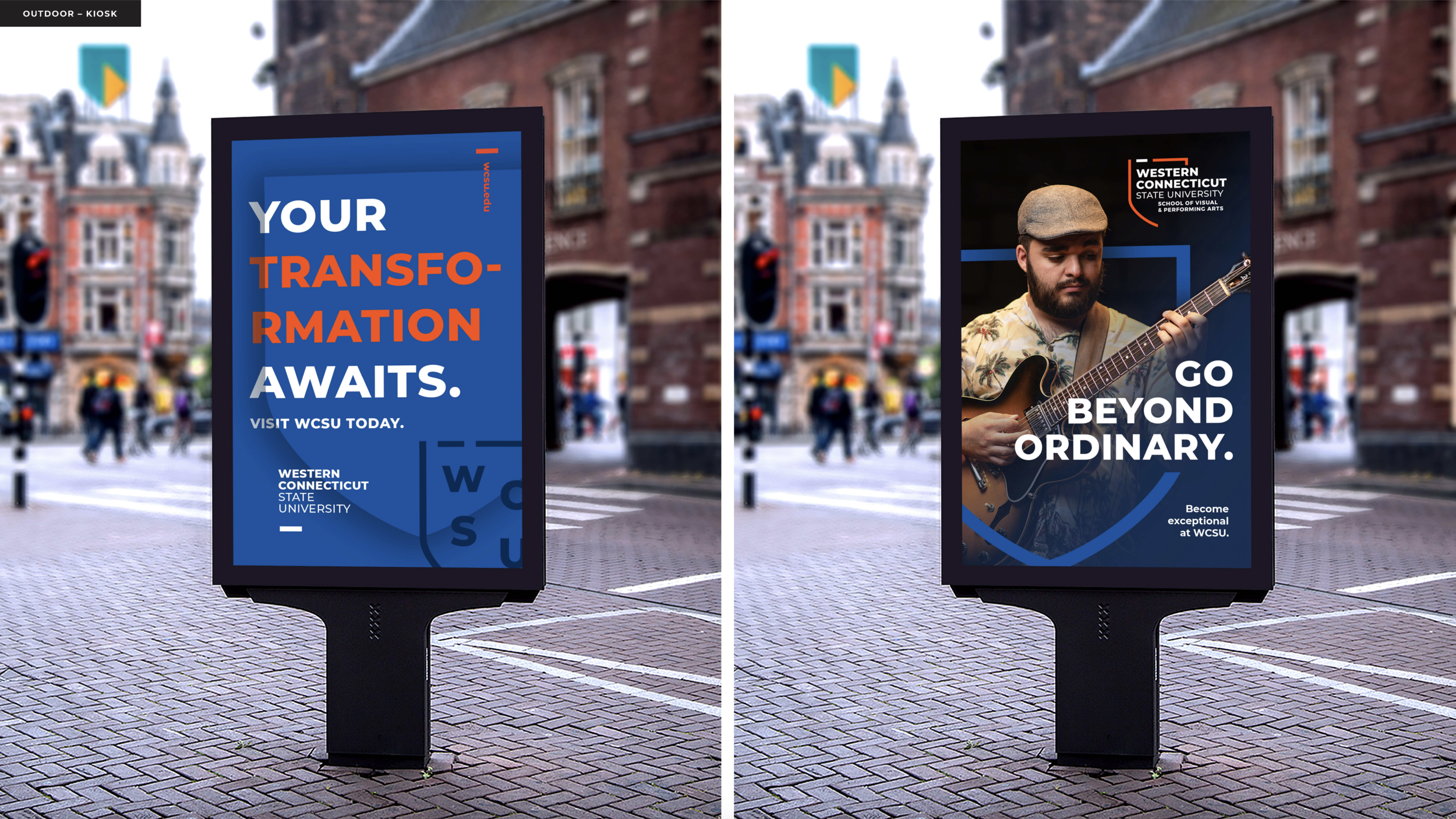
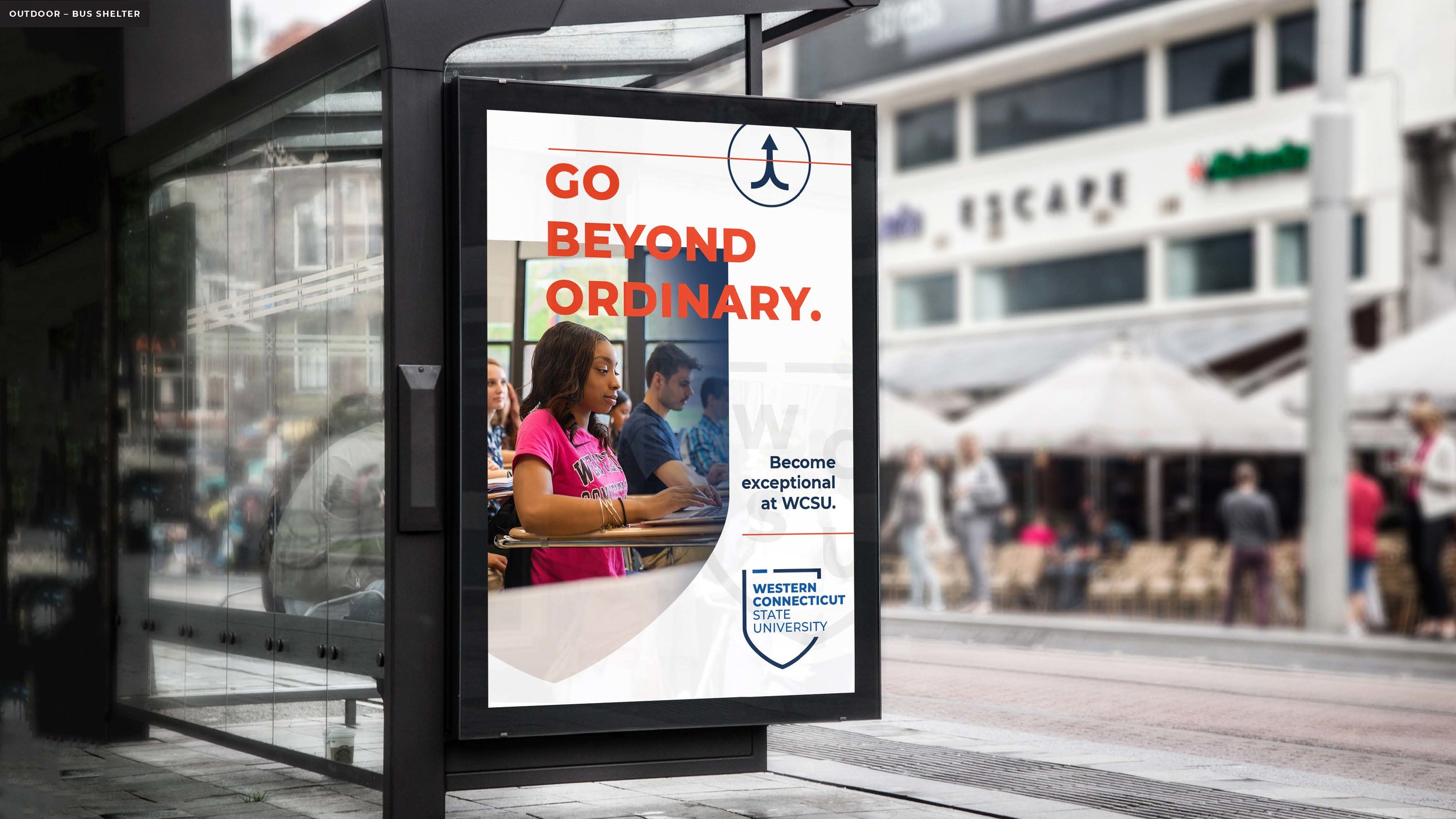
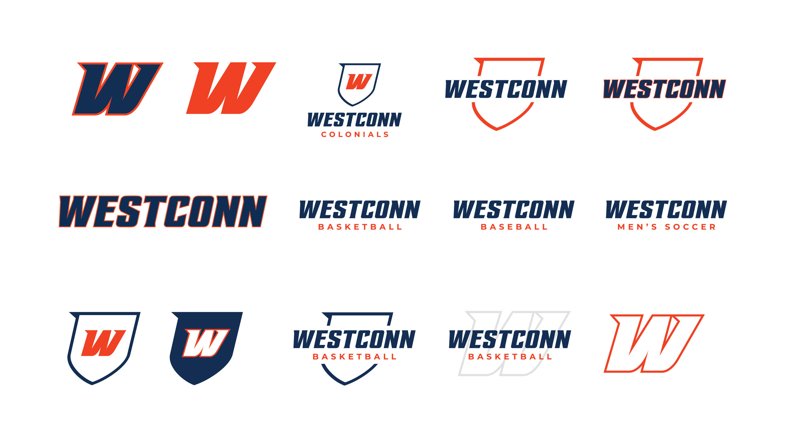
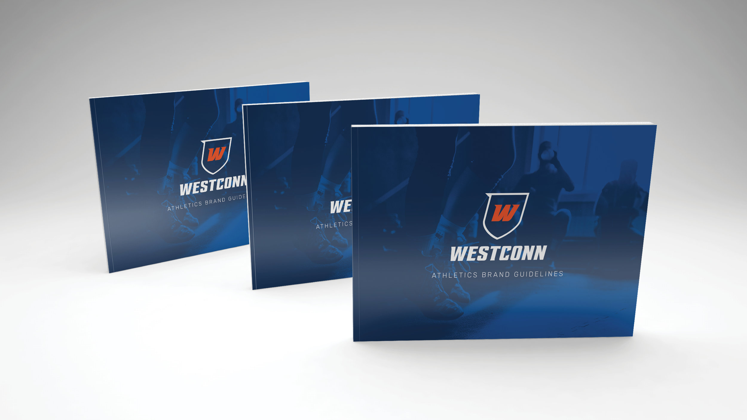
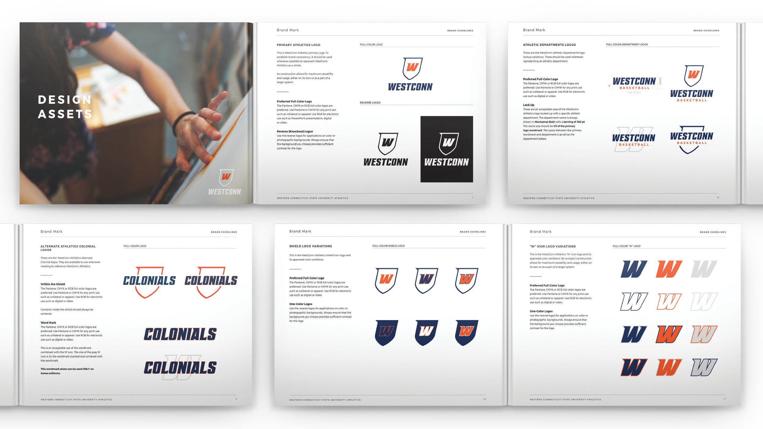
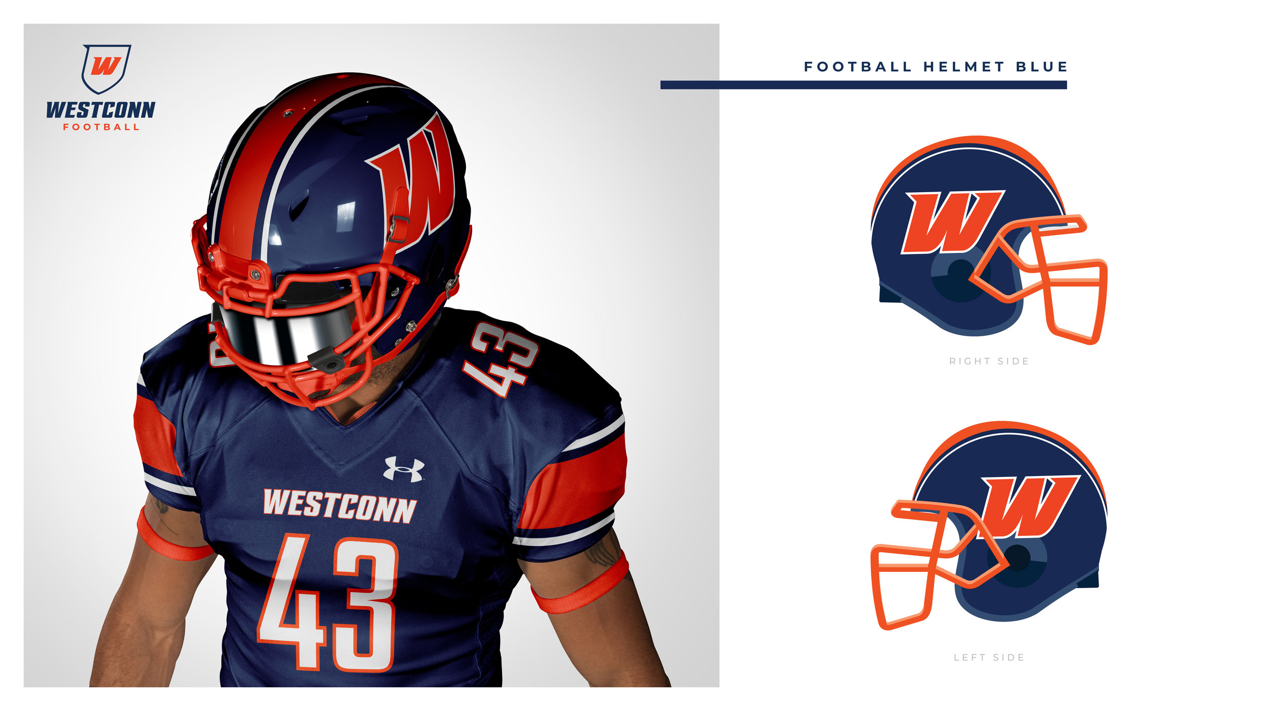
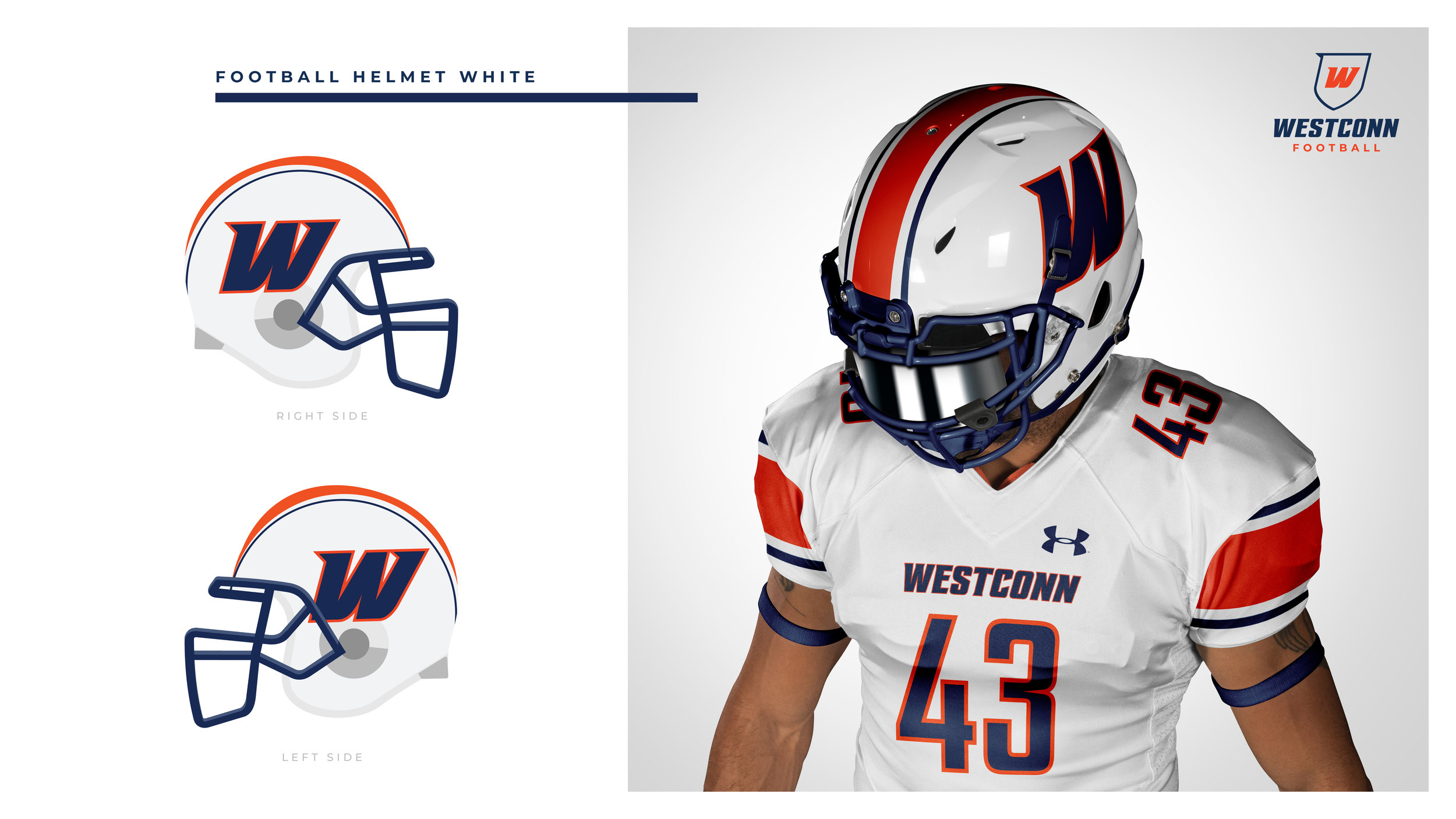
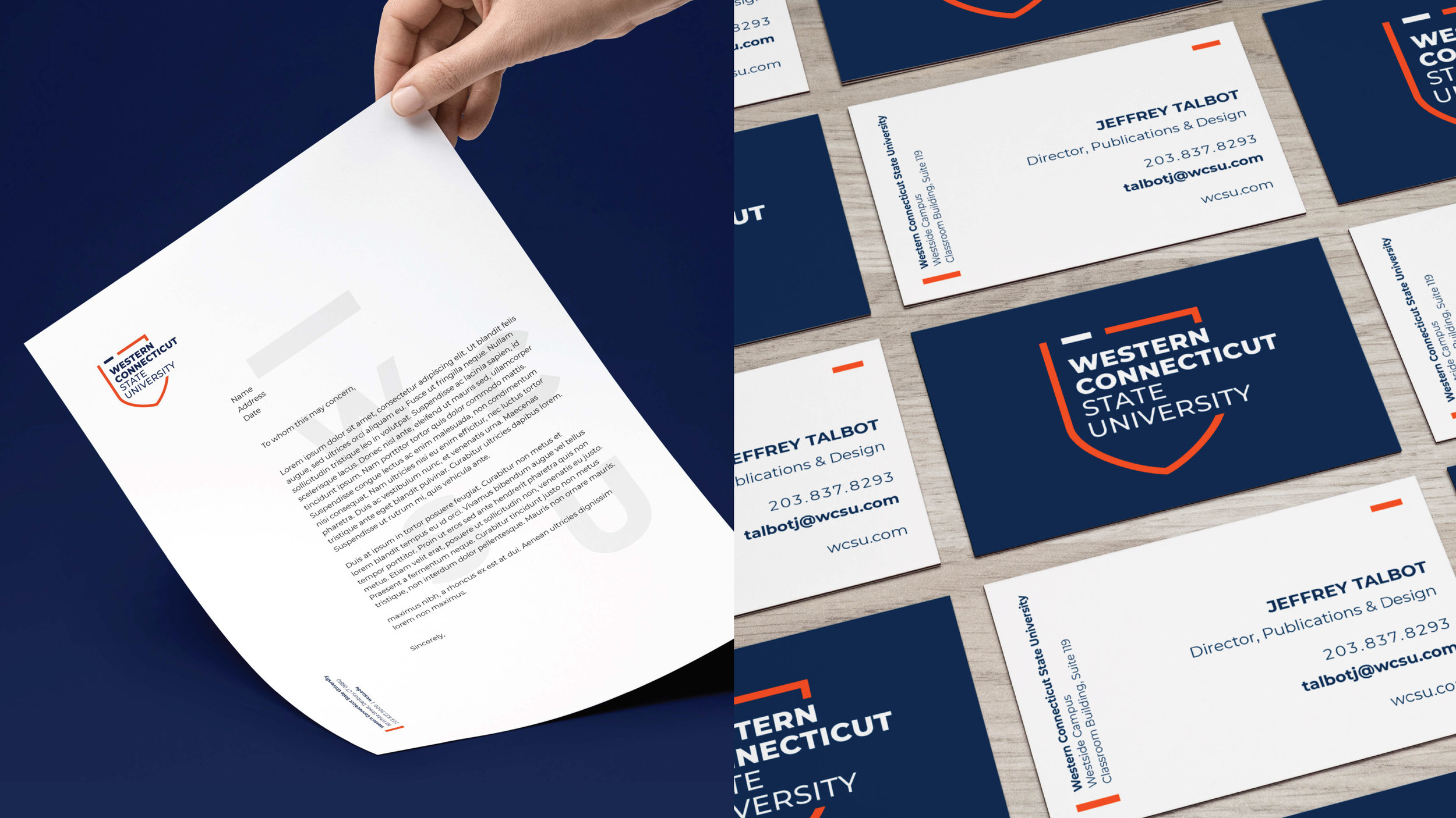
Western Connecticut State University (WCSU) is evolving from a local area university to a regional brand. With this transformation, they were in need of a brand reposition, allowing us to recreate and activate their brand in a modern way. Their old brand, messaging, and strategy was outdated and inconsistent, which is why they looked to us to create a new unique story and brand for WCSU, helping them discover their authentic story and true voice all while making their school’s brand more clear, compelling and consistent. We restructured their entire brand architecture from top to bottom– creating their new logo and identity including colors, typography, photoshoots, ads, and a viewbook while also rebranding their athletic department and designing uniforms and apparel.
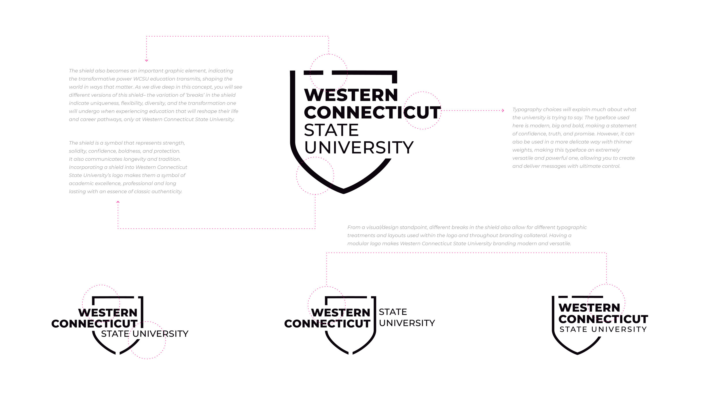
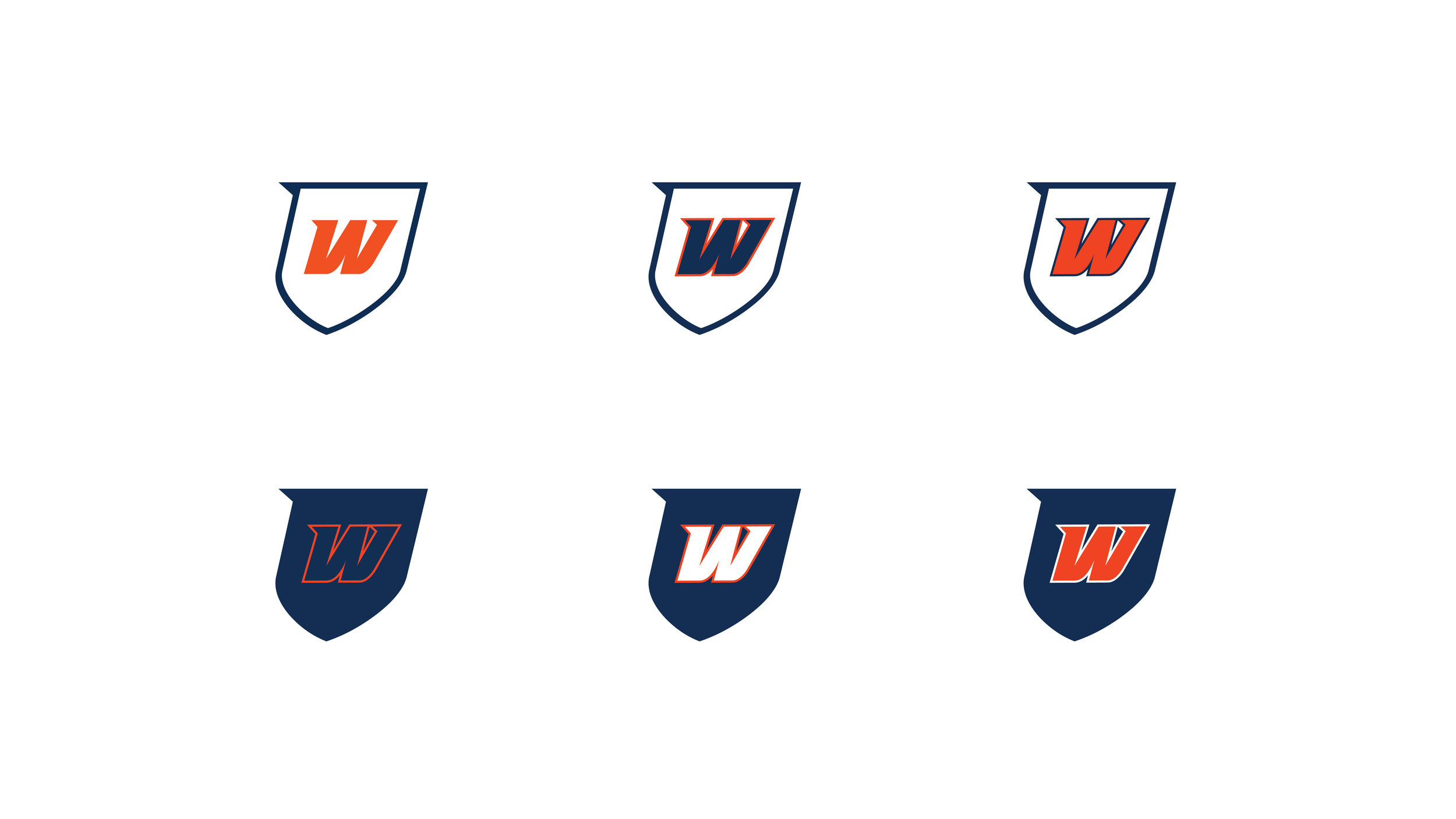
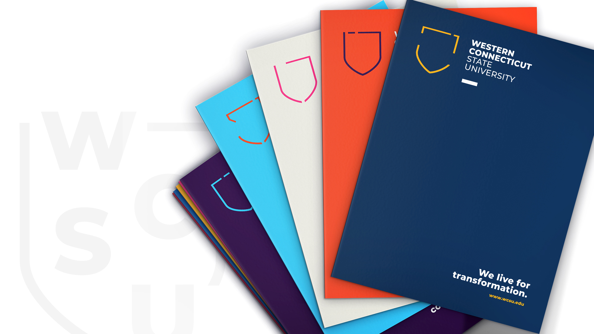
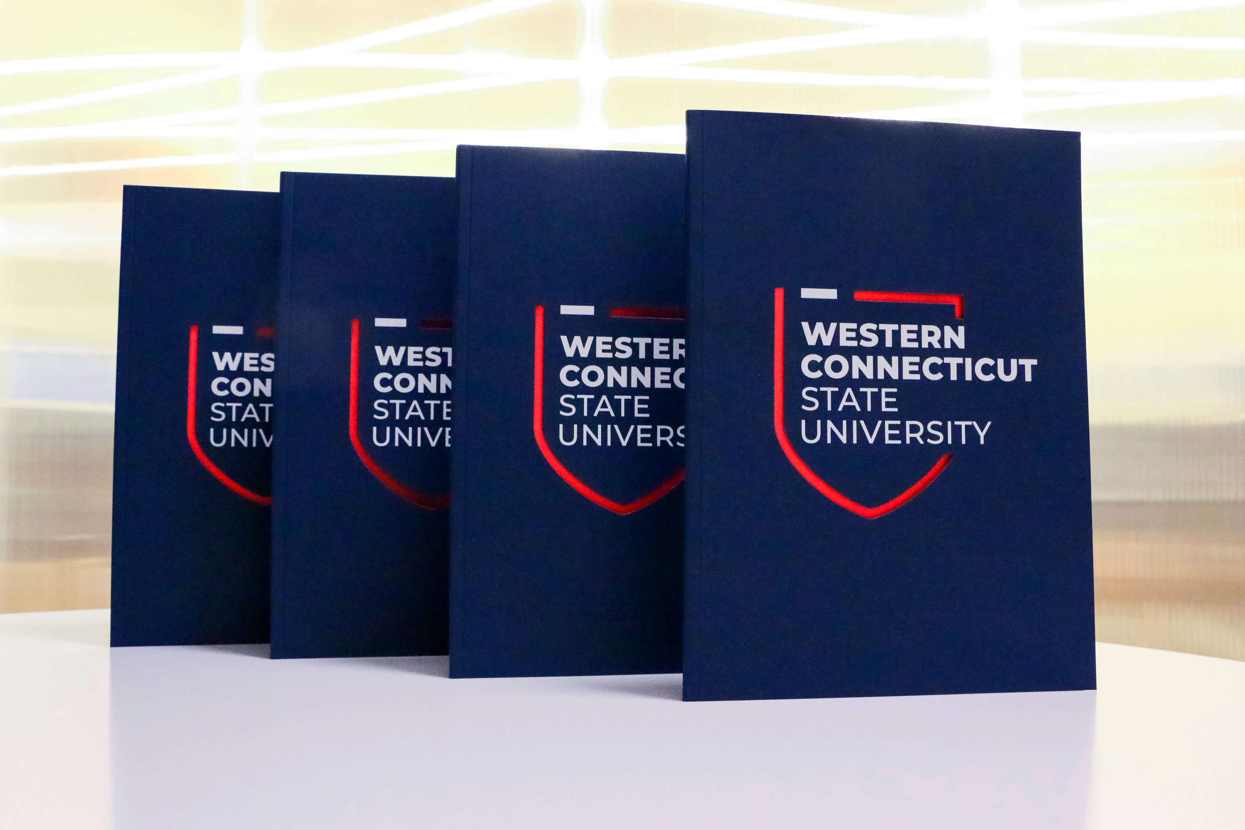
The shield is an important graphic element because it represents the transformative power WCSU education transmits, shaping the world in ways that matter. You will see different versions of this shield- the variation of 'breaks' in the shield indicate uniqueness, flexibility, diversity, and the transformation one will undergo when experiencing education that will reshape their life and career pathways, only at Western Connecticut State University. Incorporating a shield into Western Connecticut State University's logo makes them a symbol of academic excellence, professional and long lasting with an essence of classic authenticity.
Creative Director: Peter Hipsz
Lead Designer: Eleni Dimou




WESTCONN ATHLETICS


